Overview
I redesigned the brand of the regional organic farm Peternhof into a consistent system across physical and digital touchpoints, including website, product packaging, and signage. The redesign improved recognition, strengthened trust, and led to an increase in customer inquiries.
Role
Brand, Web & Product Designer
Scope
Brand System
Responsive Website Design & Implementation
Packaging Design
Signage & Physical Touchpoints
Responsive Website Design & Implementation
Packaging Design
Signage & Physical Touchpoints
Platform
Web & Physical
Duration
~ 12 months
Tools
Illustrator
Photoshop
Figma
Wix
Photoshop
Figma
Wix
Context
Peternhof is a regional organic farm in Bavaria offering eggs and a growing range of related products such as egg liqueur, pasta, and fruit juices. Over time, new products were added, but the visual presence did not keep up.
Packaging, signage, and the website lacked consistency and no longer reflected the quality or philosophy of the farm. In a local business context, recognition, trust, and visibility are critical, especially when customers encounter the brand in farm shops or regional stores.
The goal was to create a clear, recognizable identity that feels modern, signals quality, and stays grounded in the character of a local organic farm.
Visual Identity
The identity is built around a reduced, flat visual language designed to scale across formats, from small packaging labels to large signage and digital screens.
Rather than creating individual designs, the goal was to build a flexible system. I developed a logo and custom wordmark as the brand core, supported by muted greens and browns.
A recurring brand landscape, built from simple layered 2D forms, appears across all touchpoints to create recognition and consistency.
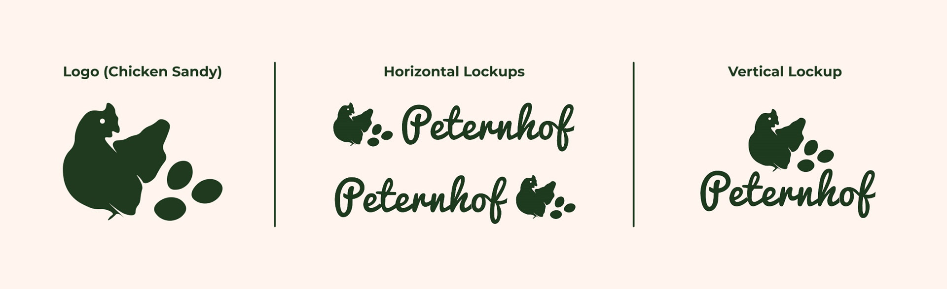
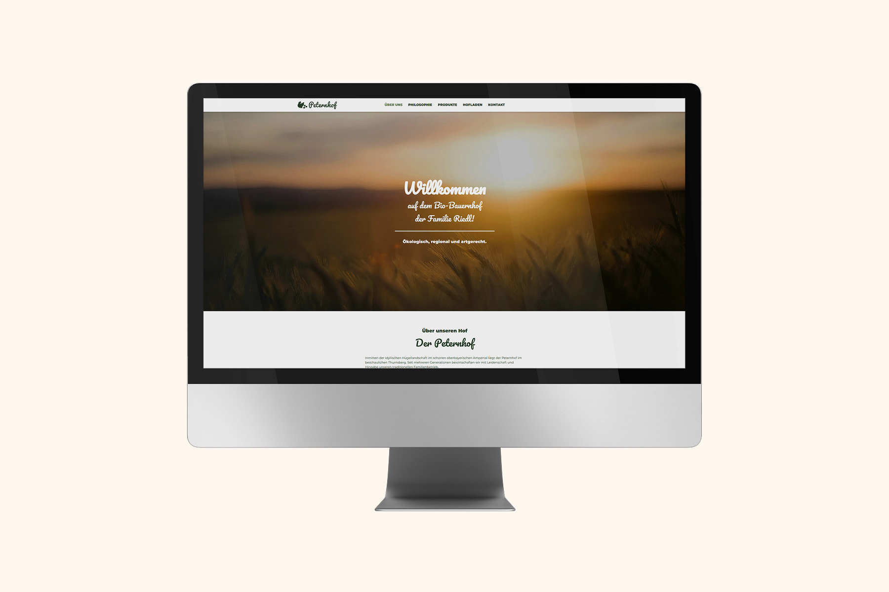
Logo and Lettering
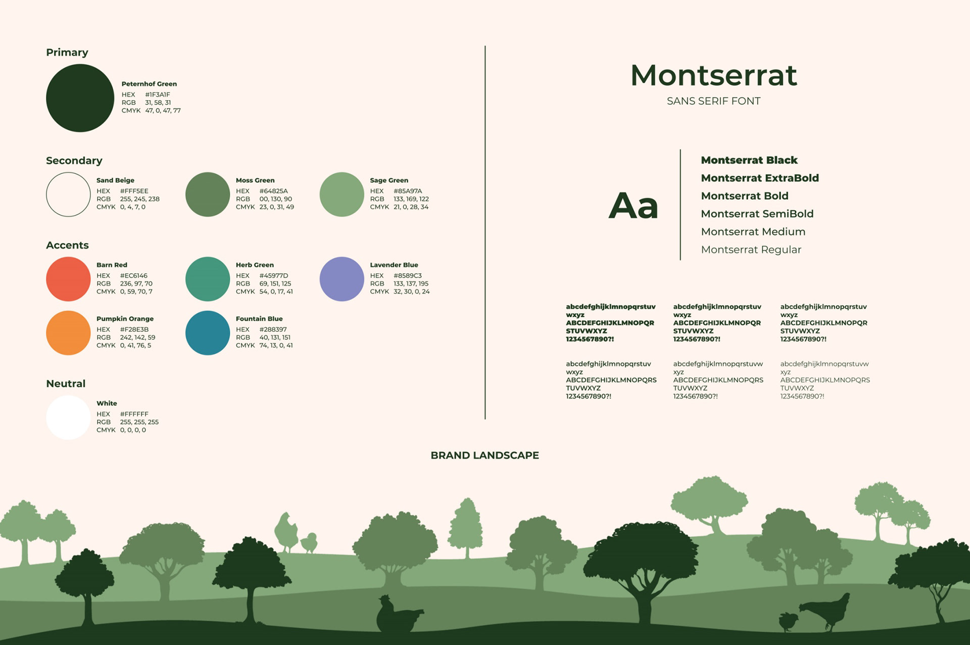
Style guide
Website Design
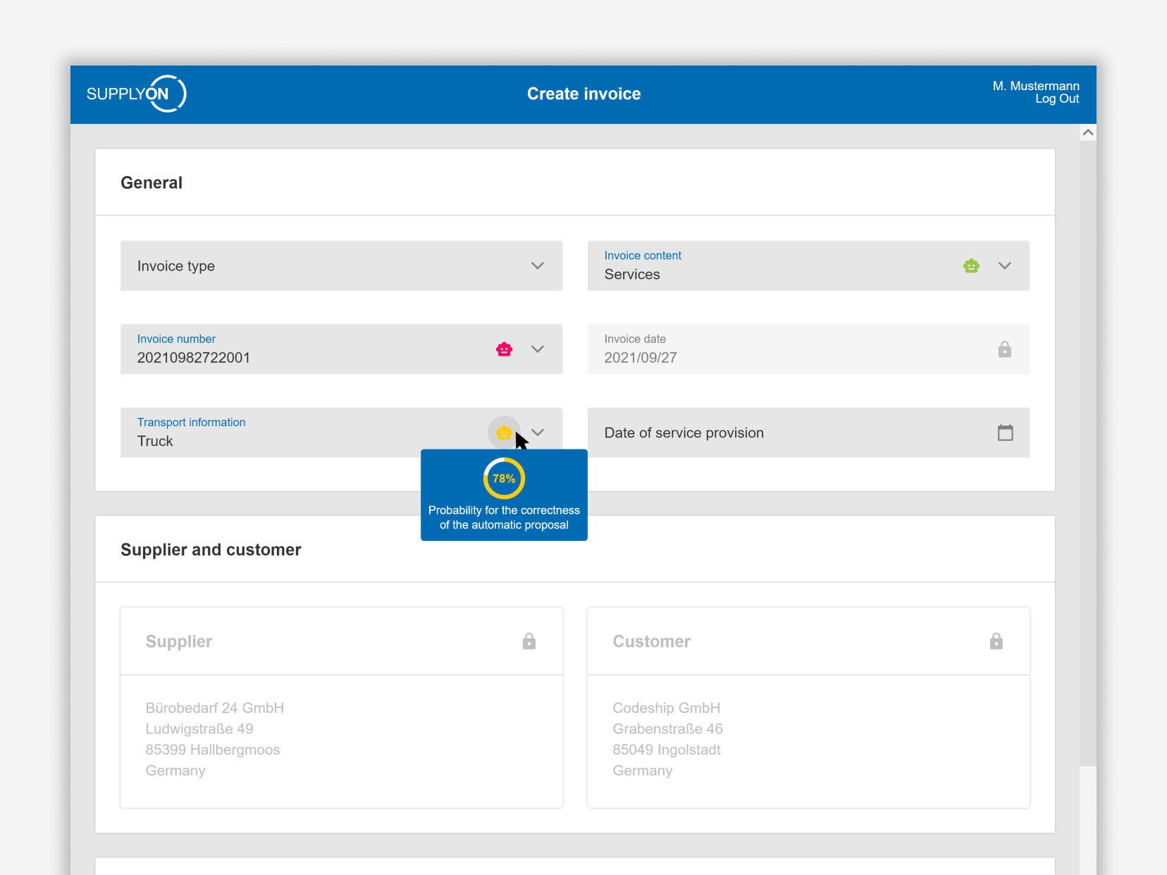
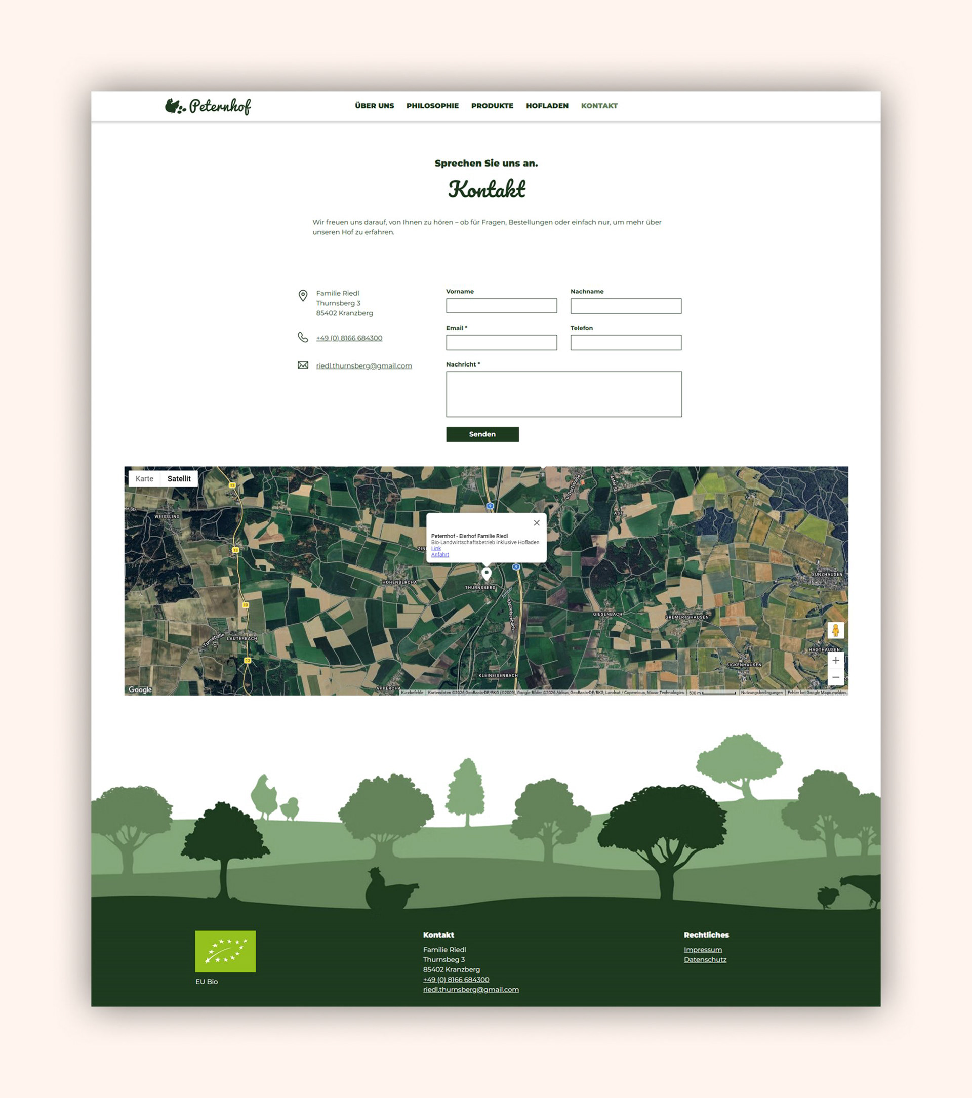
The website was designed as the farm’s central digital touchpoint: introducing the business, explaining its philosophy, presenting products, and giving potential customers a clear path to get in touch. A prominent “Become a customer” CTA on the homepage supports the main business goal: turning interested local visitors into new customers.
I designed and implemented the responsive website using Wix, translating the visual identity into clear page layouts and reusable sections. The focus was on readability, trust, simple navigation, and reliable use across devices.
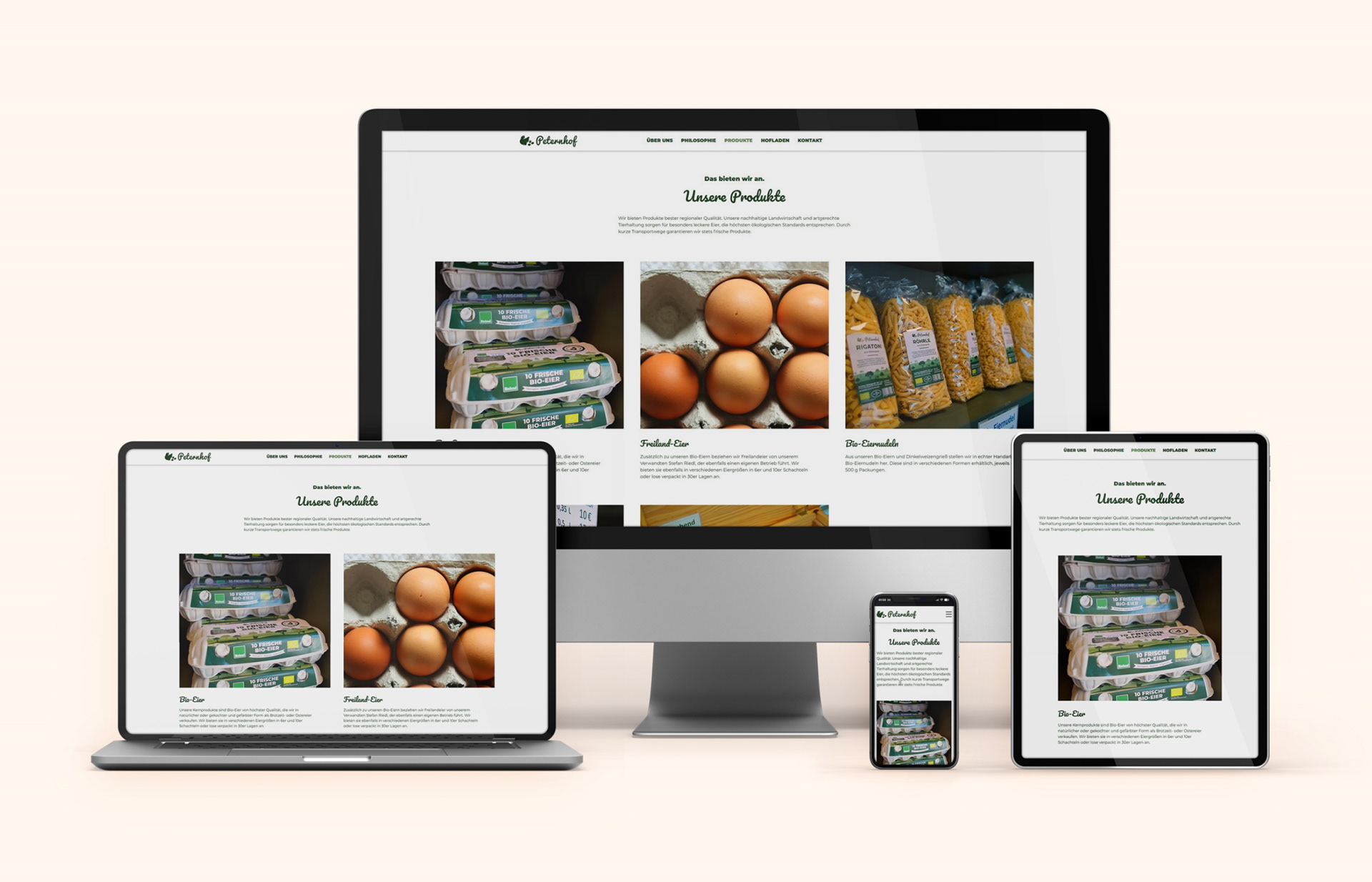
Responsive website for different devices of various sizes
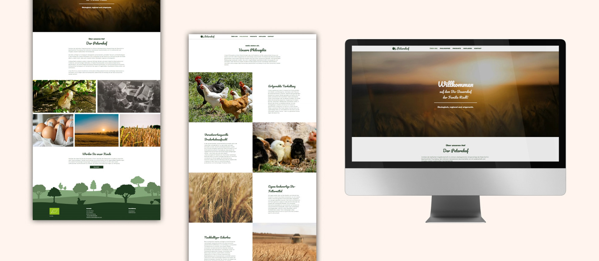
Website design
Website design
PRODUCT AND Sign Design
I designed a packaging system across multiple products including eggs, liqueur, pasta, and juices. Rather than creating isolated designs, the focus was on building a system: a consistent structure combined with flexible elements. In addition, I designed signage for the farm, with a focus on visibility and clarity from a distance.
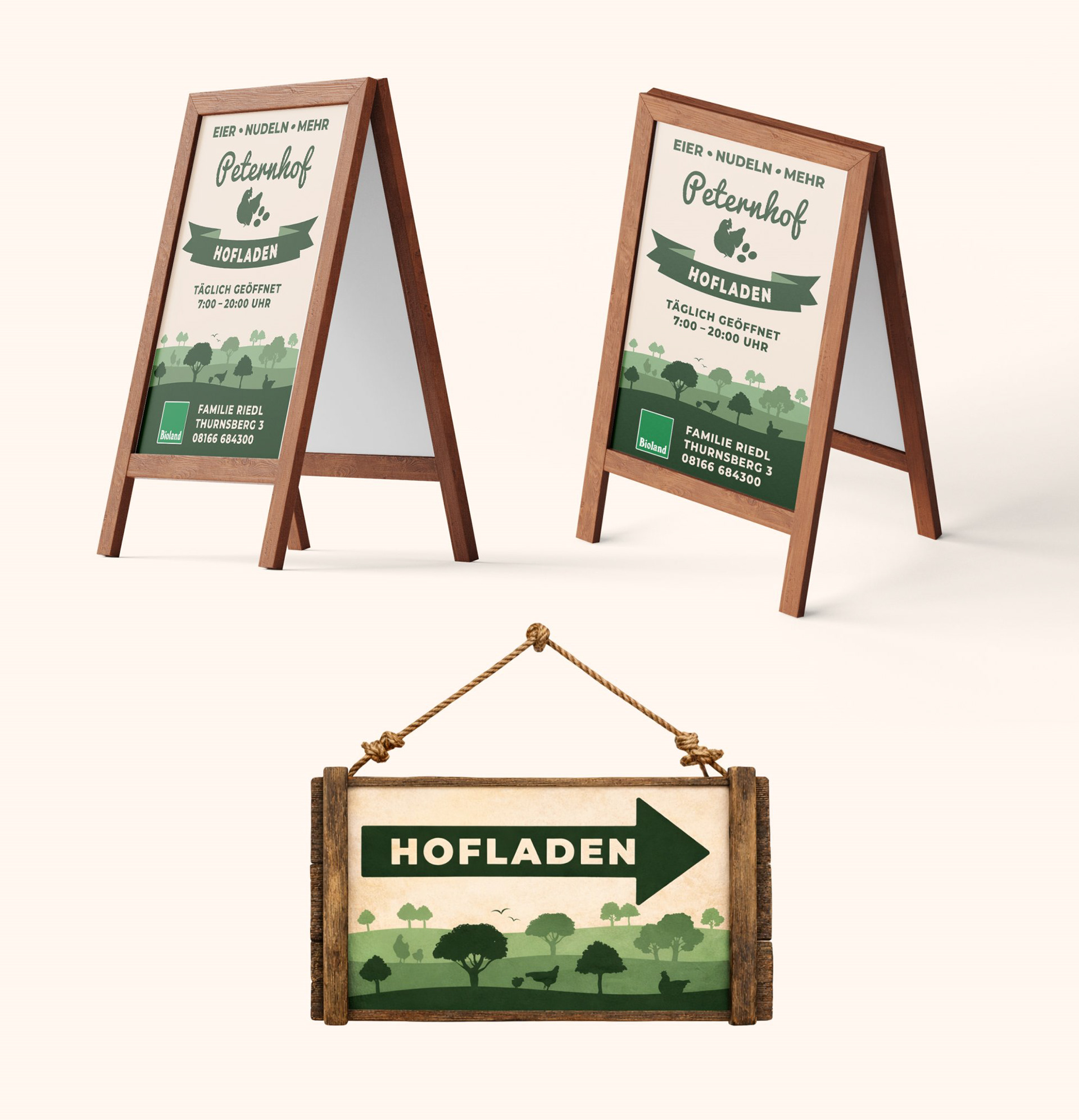
Signage
Conclusion
The result is a consistent identity that connects physical and digital touchpoints while staying true to the farm’s character.
Following the redesign, customer inquiries increased, particularly from new customers. Feedback has been consistently positive, with the new design perceived as clearer, more modern, and more trustworthy.
The project shows how a consistent brand and digital experience can support growth, even in a local, non-digital-first business context.