Overview
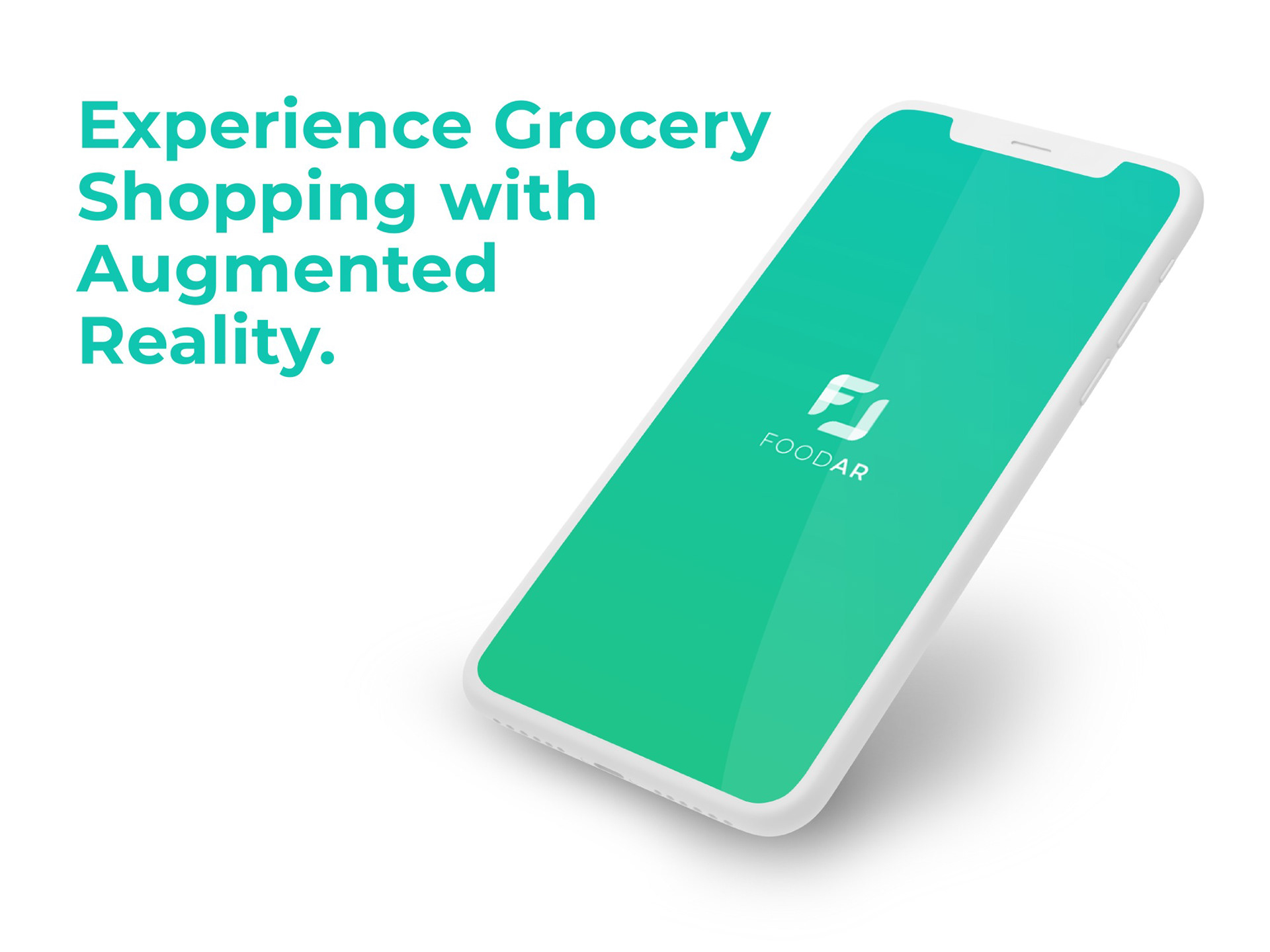
FOODAR is an AR-based retail app concept supporting the entire shopping journey, from planning and inspiration to in-store navigation, contextual product scanning, and checkout. As UX/UI Designer, I led the end-to-end UCD process, translating user insights into validated interaction patterns and shaping key decisions through early wireframing and prototyping. I designed the UI based on a clear visual identity and design system and implemented motion design for transitions and feedback.
Role
UX/UI Designer
Scope
UX Concept
UI Design
UX Evaluation
UI Design
UX Evaluation
Platform
Mobile
Duration
~ 4 months
Tools
Adobe XD
Balsamiq
Illustrator
Photoshop
After Effects
Premiere Pro
InDesign
Balsamiq
Illustrator
Photoshop
After Effects
Premiere Pro
InDesign
Promotional film FOODAR
Context
Grocery shopping requires planning, navigating the store, product comparison, and budget control – often overwhelming for our target group: users who seek better structure, easier planning, and want to learn more about products. FOODAR addresses this by connecting inspiration, planning, in-store navigation, product transparency, cost tracking, and cashless payment into one coherent journey. Recipes transform into shopping lists, Augmented Reality (AR) supports product discovery and navigation, and real-time cost visibility supports decision making. The app can be personalized to individual needs such as allergens and intolerances.
UCD Approach
We explored user pain points and defined personas representing key behavioral patterns within the target group: a sustainability- and budget-conscious student and an efficiency-driven planner focused on healthy meals. Each persona was mapped to a concrete usage scenario. Based on these insights, we defined and iteratively refined the information architecture to ensure a clear structure throughout the design process.
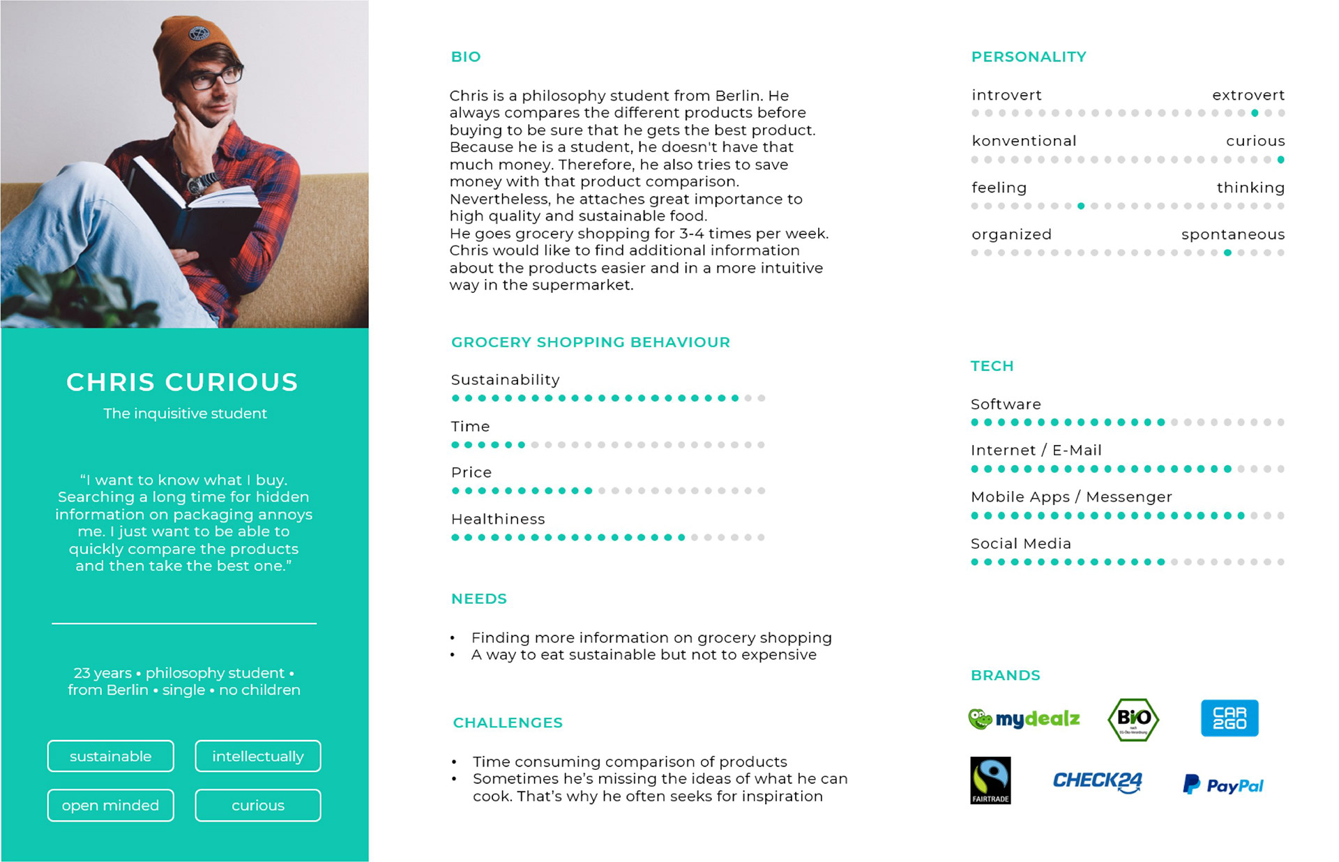
Persona Chris Curious
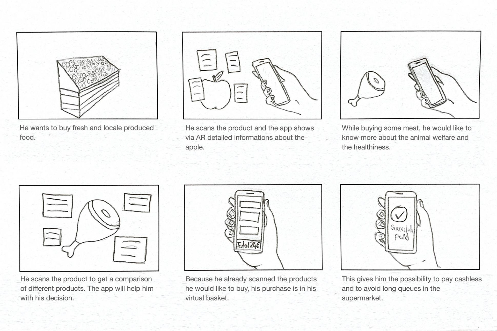
Chirs' user scenario
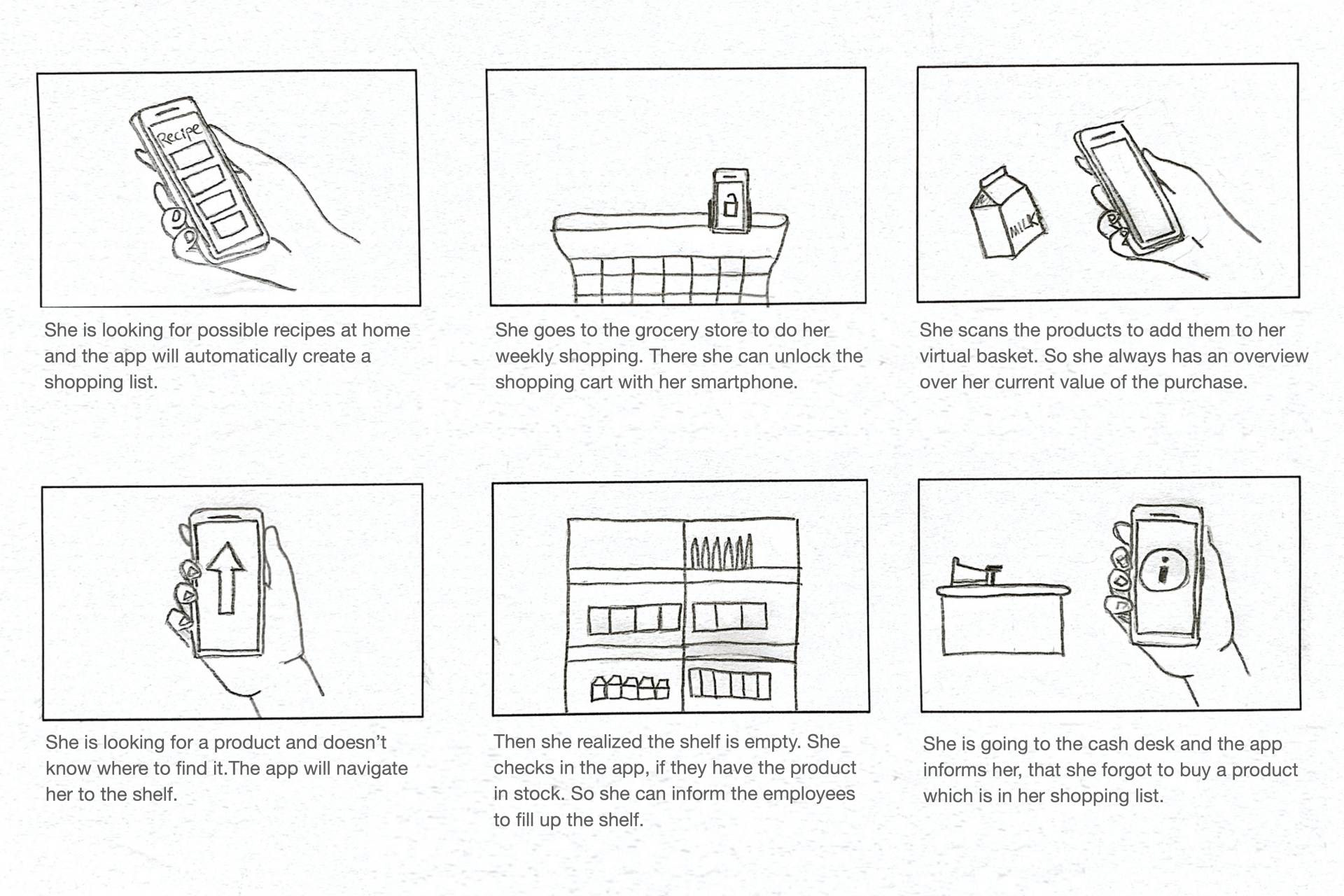
Stacy's user scenario
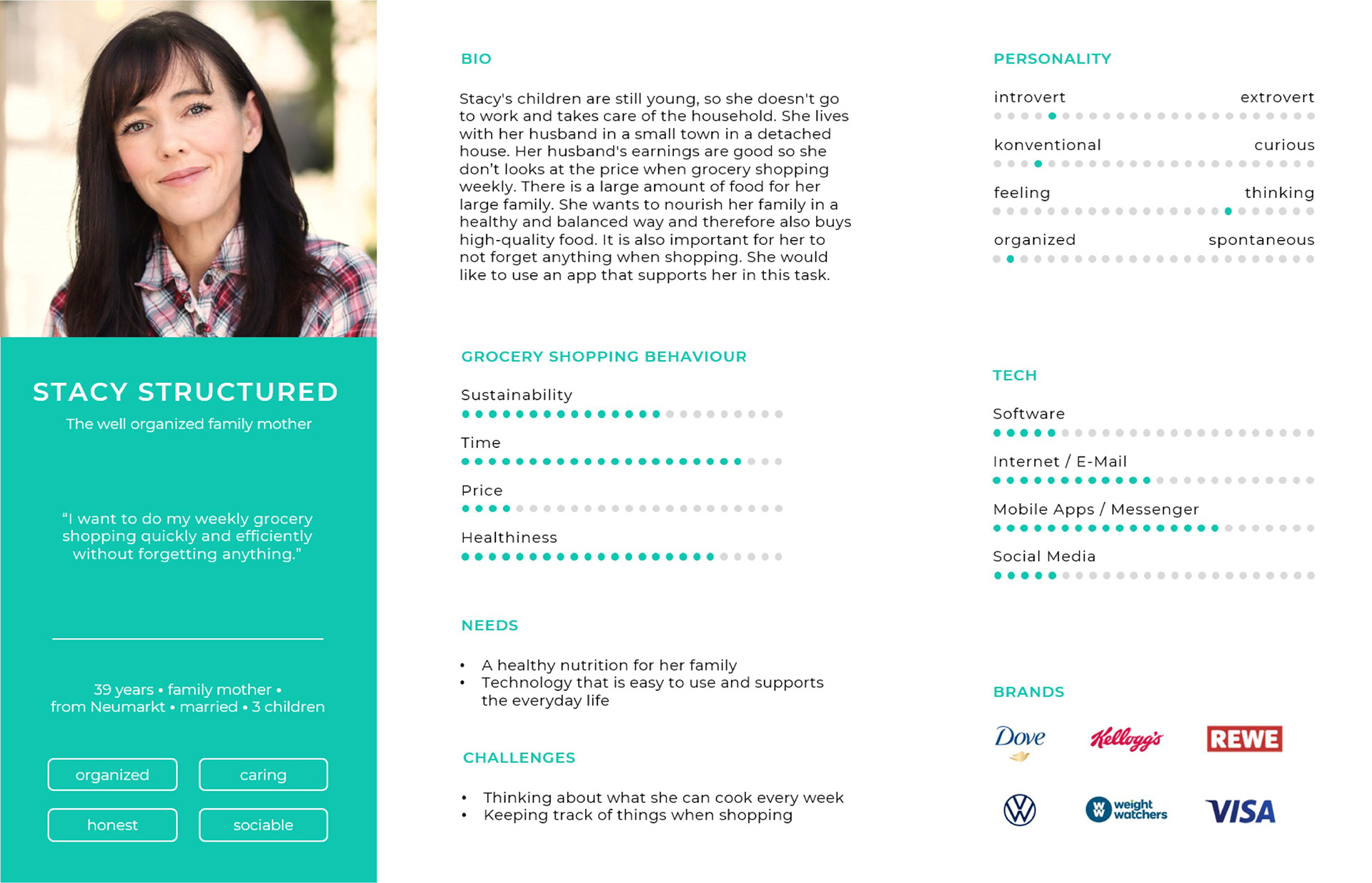
Persona Stacy Structured
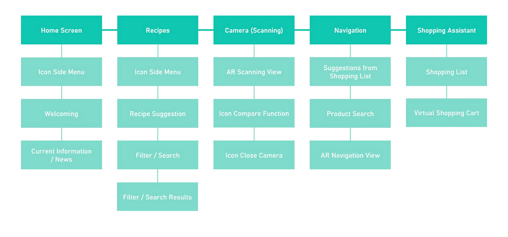
Rough information architecture
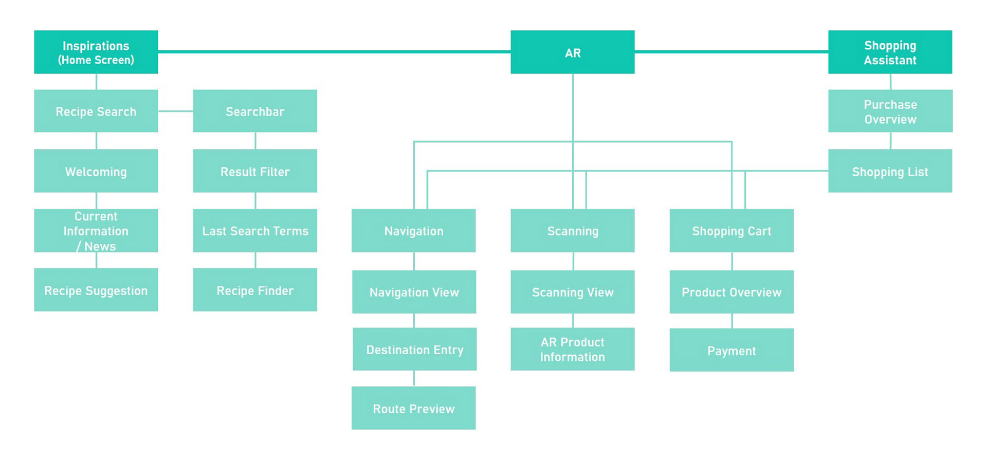
Refined information architecture
Wireframing & Prototyping
We translated the information architecture into low-fidelity wireframes to define layouts, task flows, and interaction logic before visual refinement. The navigation bar was deliberately reduced to three core elements: Inspiration (pre-shopping), AR features (persistent access), and the Shopping Assistant (in-store guidance), structuring the app into clear usage contexts.
Interaction patterns such as shortcuts, filters, search, and bottom overlay menus were established to support efficient task flows. In the AR view, product information is structured through compact, expandable cards, keeping the interface clear and managing cognitive load.
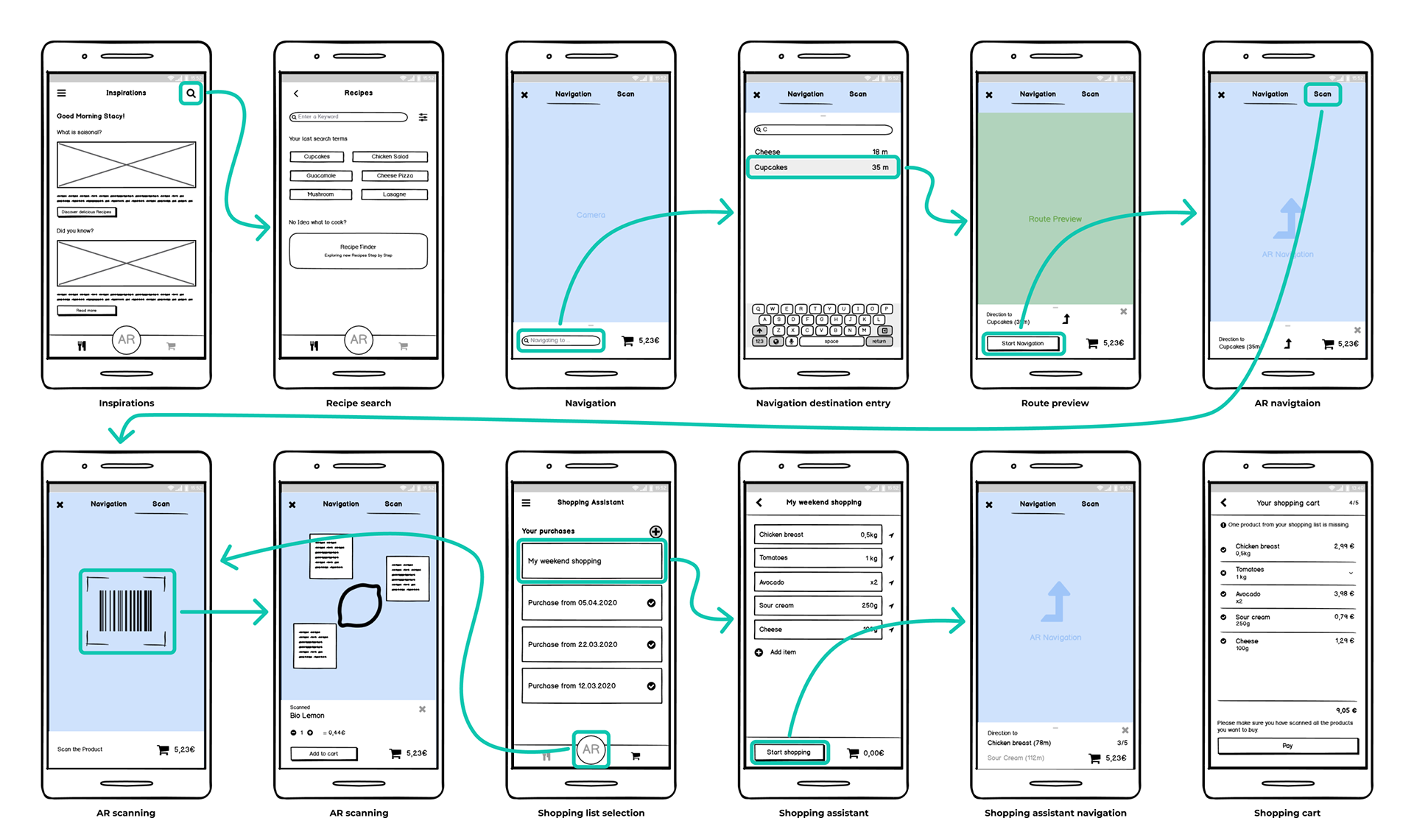
Wireframes
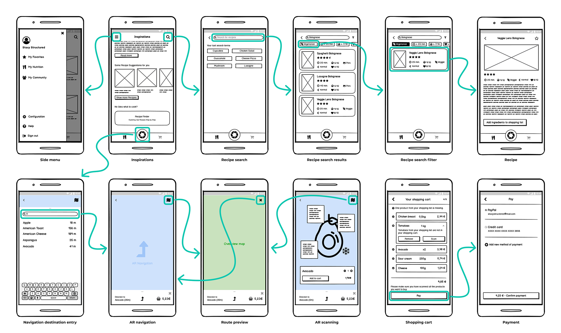
Refined wireframes
Usability Testing
Interactive prototypes allowed early validation of core journeys and navigation logic. We conducted two formative evaluation loops with eight participants and five core tasks, covering configuration, recipe search, AR navigation and scanning, shopping assistance, and payment.
Results & Impact
The first loop revealed unclear AR entry points, insufficient navigation feedback, and unclear interaction elements. Participants asked, for example, “How do I stop the navigation?” and “Is a sustainability score of 4 good or bad?” Others expected tags on AR cards to be clickable and wanted to reuse previous shopping lists. These insights led to clearer AR access, improved affordances, stronger confirmation patterns, and refined visual hierarchy. The second loop with an early high-fidelity prototype confirmed more efficient task completion and increased user confidence.
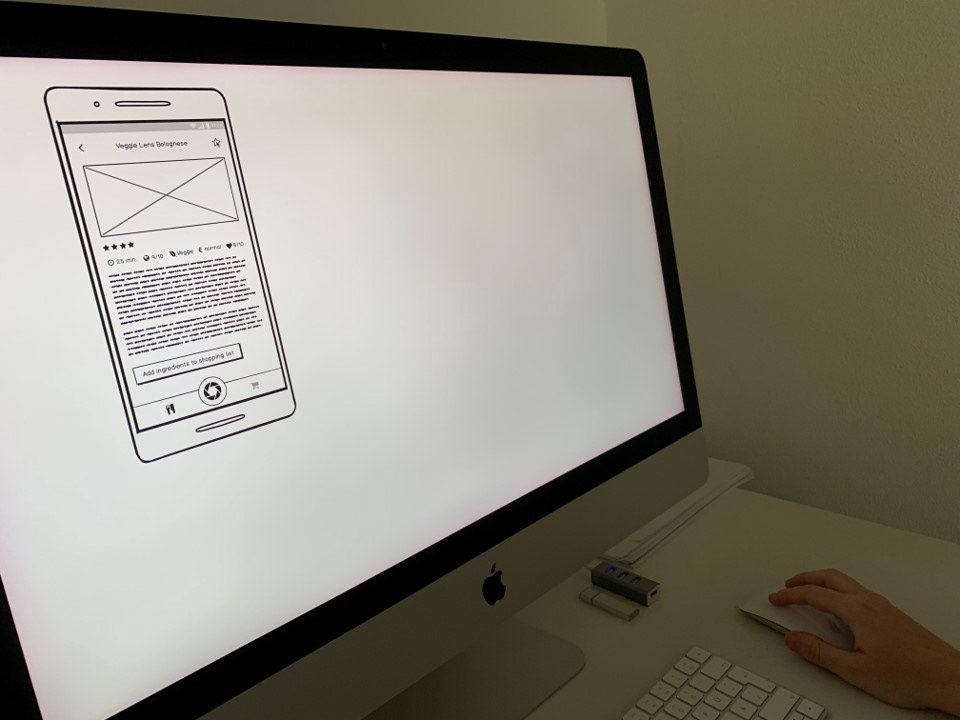
First evaluation lopp with low-fidelity wireframes
Demo of the second evaluation loop with high-fidelity screens
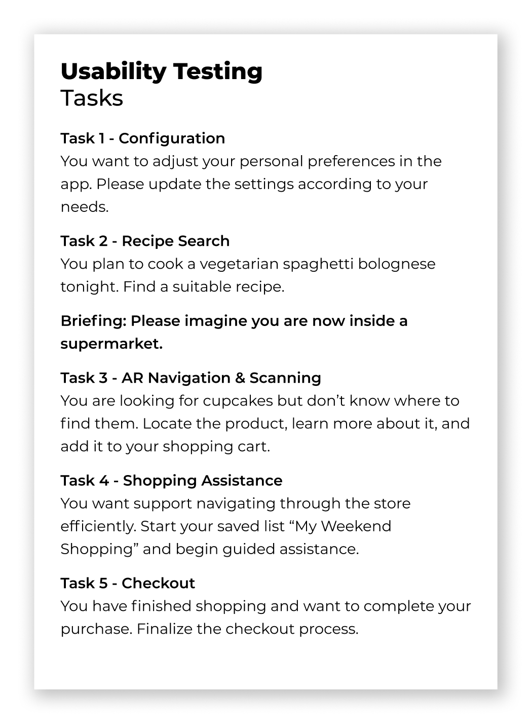
Tasks
Visual Identity & Design System
The visual identity positions FOODAR as a modern, AR-driven retail experience. Logo, wordmark, color system, and gradient establish strong brand recognition, with the logo strategically embedded as a central AR entry point in the navigation bar. Moodboards informed a structured style guide defining color tokens, typography, layout principles, and reusable components. This system ensured visual consistency and enabled efficient iteration.
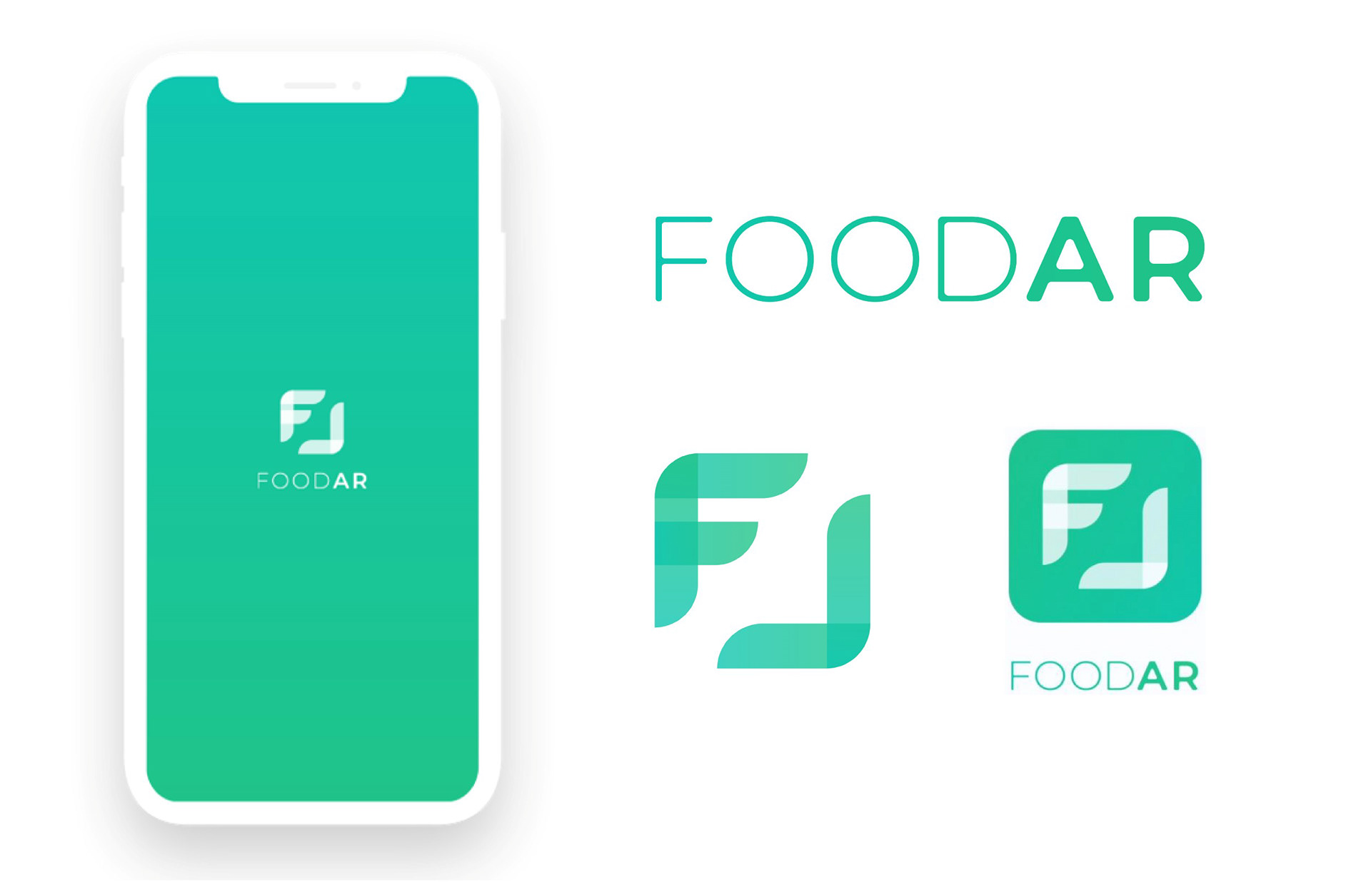
Brand design
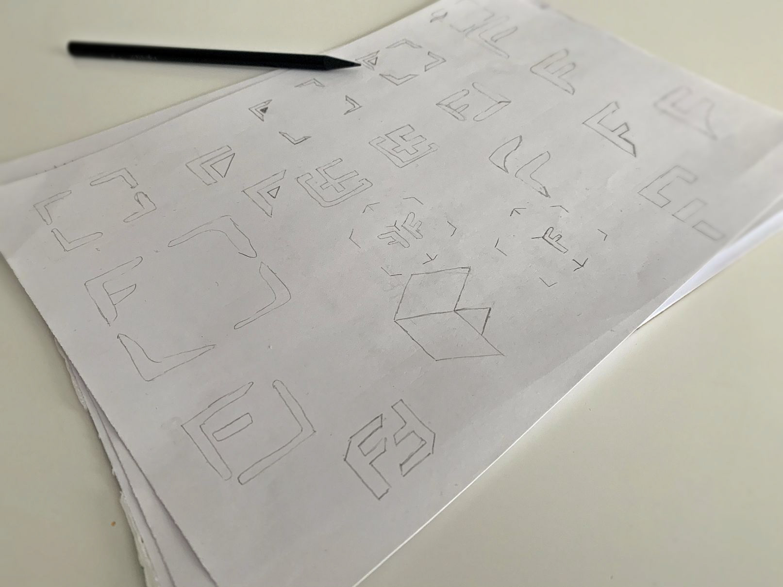
Logo sketches
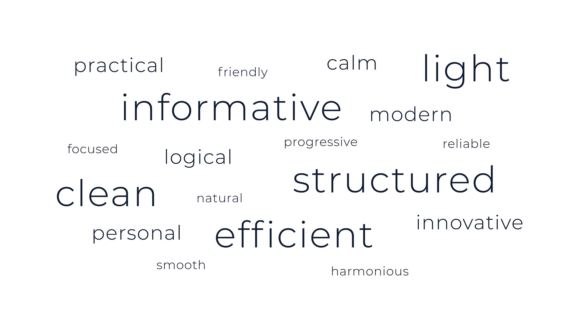
Moodboard wording
Moodboard designs
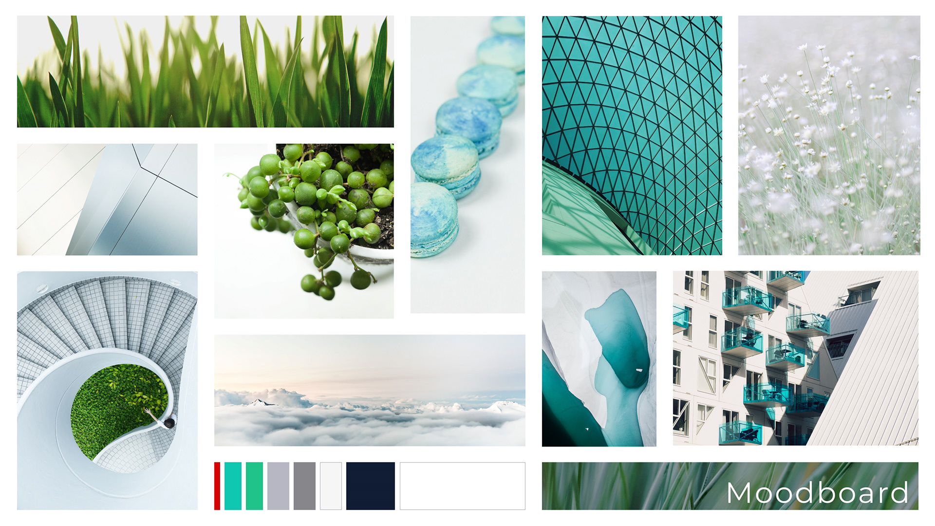
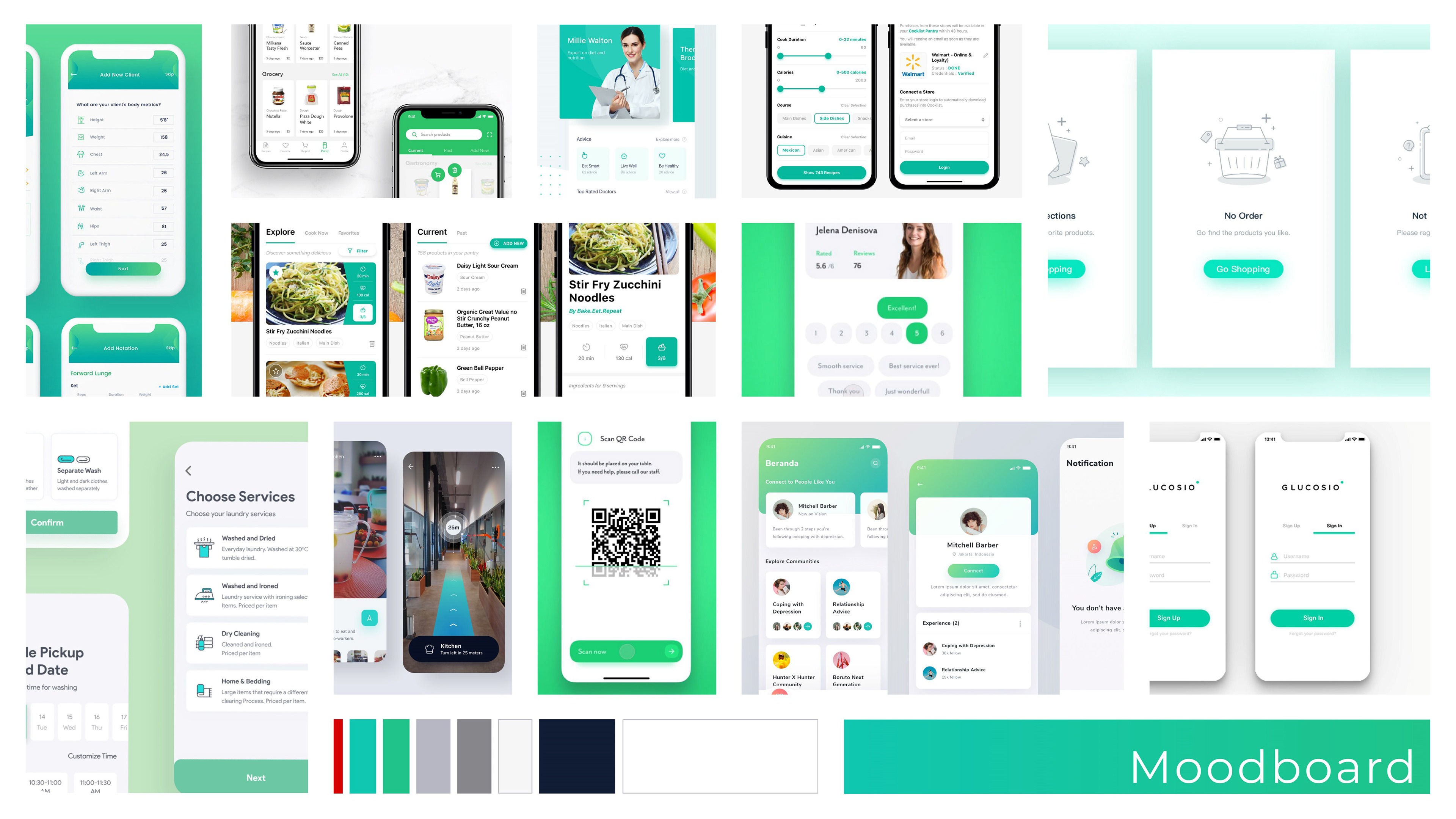
Moodboard images
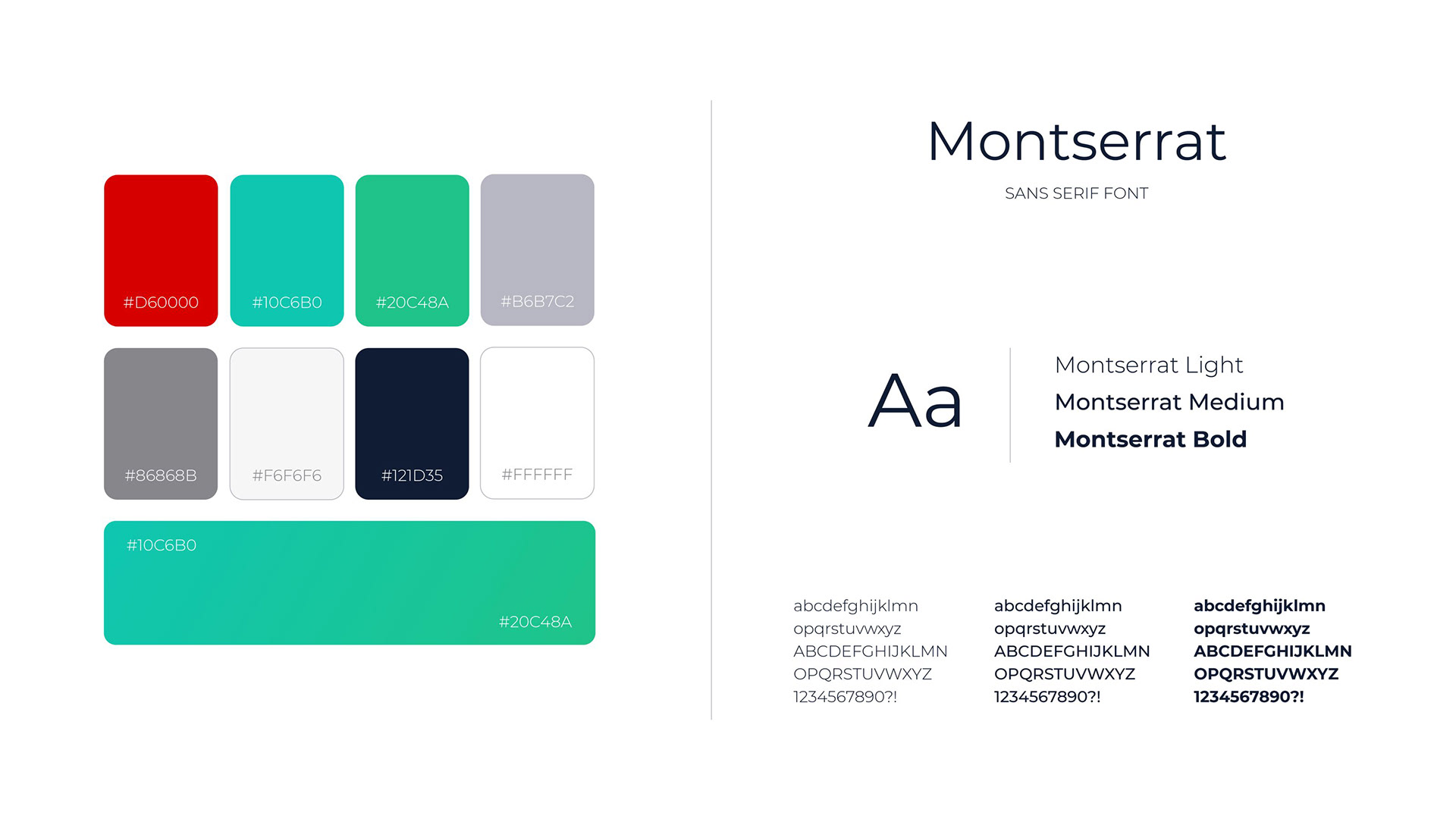
Colors and typography
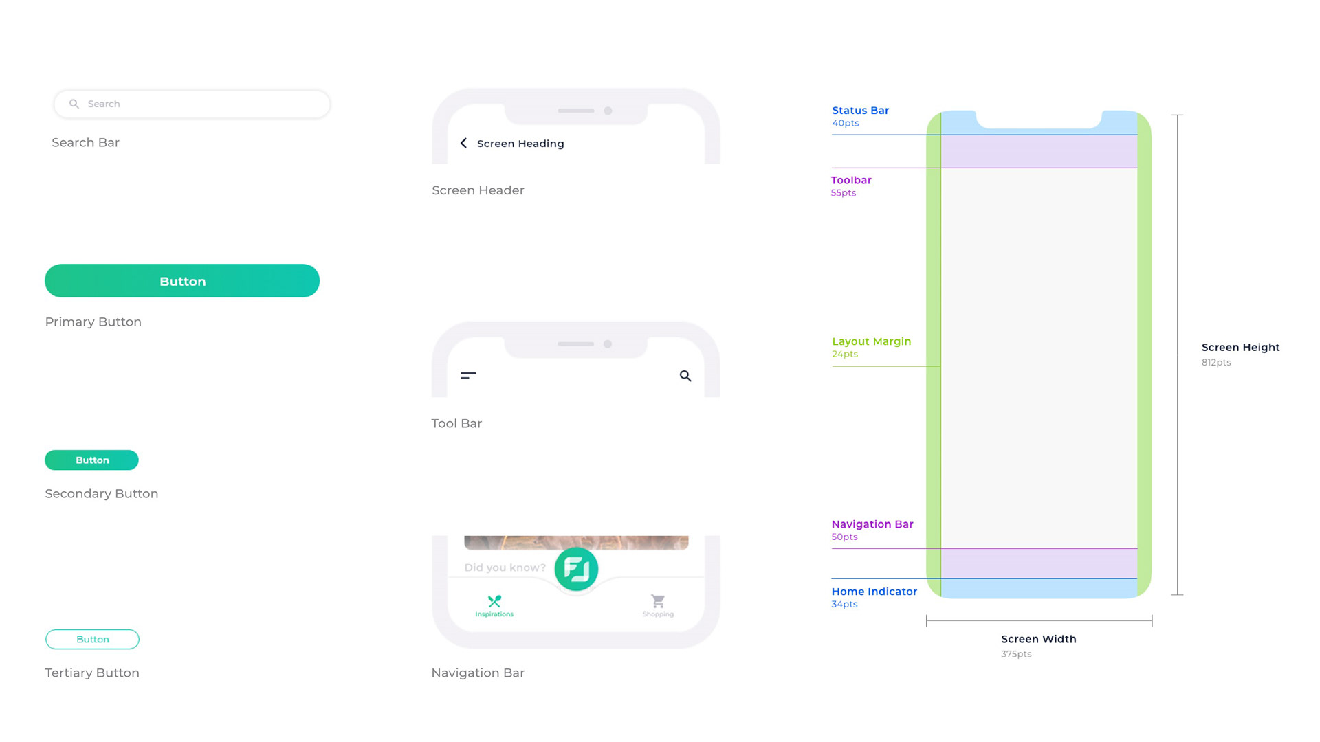
Components and screen layout
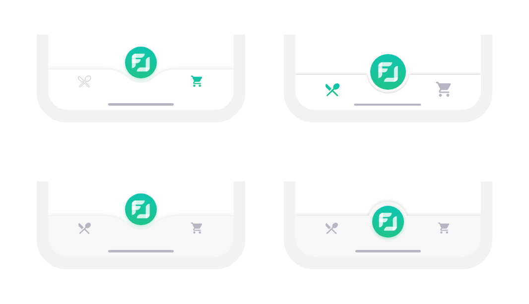
Discarded navigation bar variants
Components and screen layout
UI Design
The UI follows a clear and lightweight visual approach optimized for use in a retail environment. A flat design language combined with consistent CI colors and gradients ensures clarity, readability, and strong brand recognition.
Usability insights informed key refinements: clearer AR access through onboarding, a persistent cancel icon for navigation control, contextualized sustainability scores, visible cost tracking during assisted shopping, and structured confirmation patterns in the payment flow.
Motion Design
Motion is used to make interactions predictable and understandable, while also directing user attention. Transitions clearly communicate state changes, for example when switching between navigation, scanning, and the shopping assistant.
The side menu scales the screen instead of overlaying it, reinforcing spatial orientation. In the AR view, cards expand and collapse smoothly to reveal more information. Microinteractions provide immediate feedback when scanning products, adding items, or confirming actions.
Motion design FOODAR
Final Concept
Introduction
FOODAR’s introduction screens onboard users by explaining the app’s structure and key functions, ensuring they can quickly access features without missing any capabilities.
Introduction
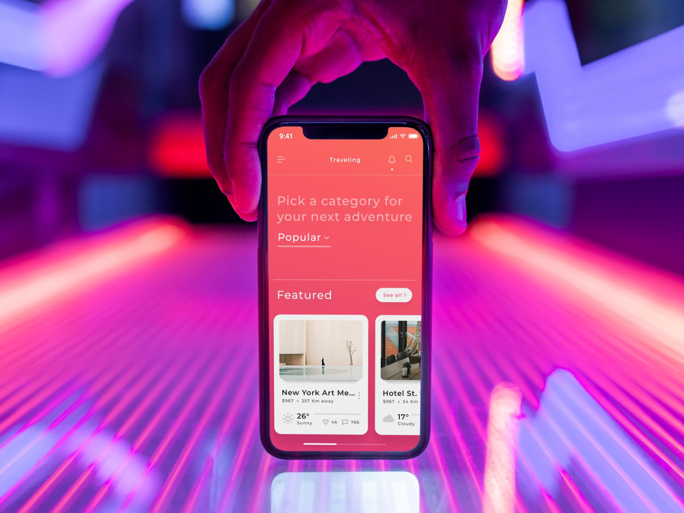
Inspiration and Planning
The inspirations and planning section provides personalized recipes and food knowledge. It allows users to plan efficiently and create shopping lists from desired recipes.
Inspiration and Planning
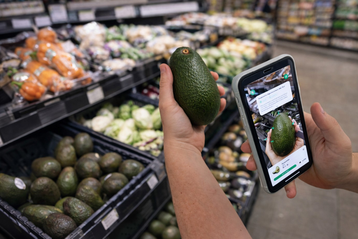
AR Navigation and Scanning
AR navigation and scanning deliver a unique shopping experience by guiding users to products via in-store routing and presenting detailed, interactive product information in AR. Personal settings such as allergens and intolerances are highlighted directly on product cards alongside sustainability, ethical, and health-related information.
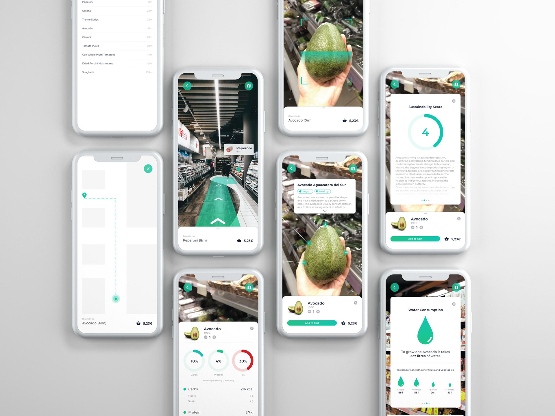
AR Navigation and Scanning
Shopping Assistant
The shopping assistant provides structured in-store guidance, helping users manage lists, track costs, while also enabling direct use of AR features within the flow.
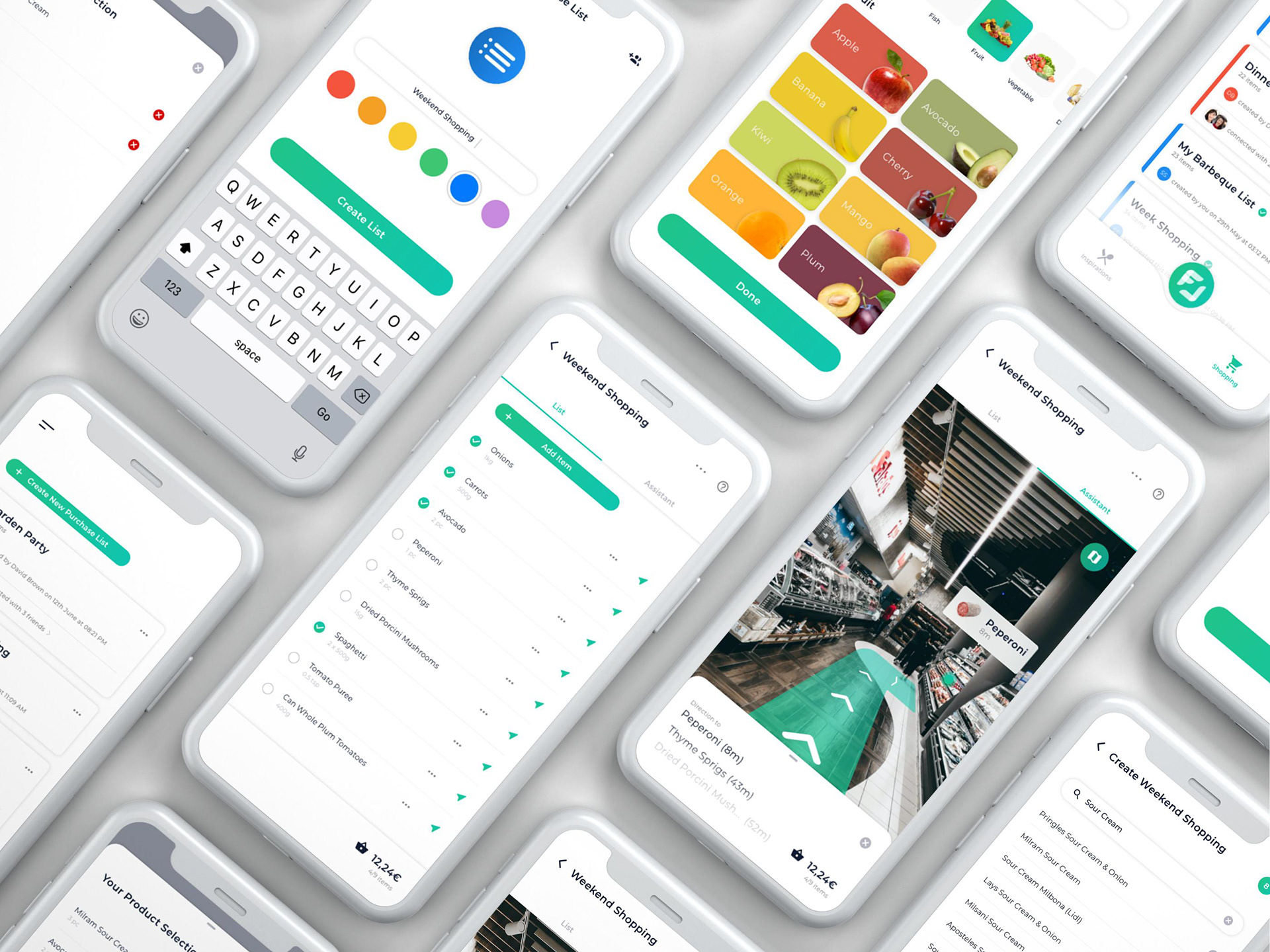
Shopping Assistant
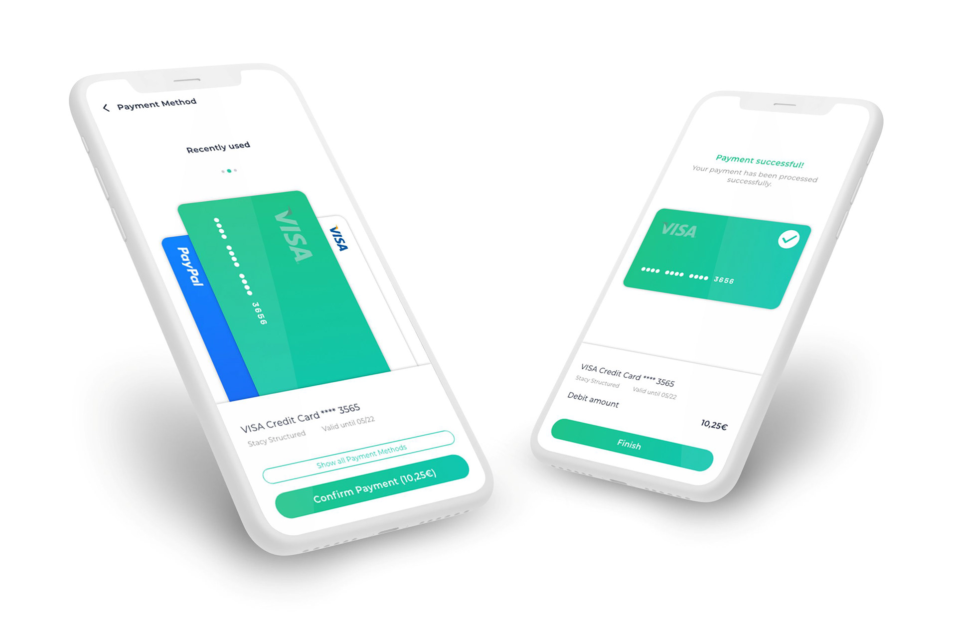
Payment
Finally, the payment module allows stress-free, cashless checkout, completing the shopping experience without waiting in queues.
Payment
Conclusion
FOODAR supports users across the entire shopping journey, from planning and inspiration to in-store navigation, scanning, and checkout. AR, as the core of the concept, guides users through the store and enables product scanning that delivers interactive product information directly in context. Recipes and personalized content support structured preparation, while tailored information (e.g. allergens and intolerances) and the Shopping Assistant provide guidance, transparency, and cost tracking during the shopping process.
A key insight was that AR only creates value when access and interaction logic are intuitive. Early iterative testing directly shaped design decisions to reduce uncertainty. The result is an interface that addresses both pragmatic and hedonic needs, with future potential in product comparison, real-time inventory, and AR-based translation features.